When people think about starting up a company they really tend to focus on getting either their product or service ready and selling it to their clients. One thing that can get left behind is ensuring they have a consistent image to put forward in those efforts. How much more professional does, say a courier company appear when they show up in uniform, with a nicely logoed car? You definitely make a statement, and it can be one of confidence, intending to be around for the long-haul, and the list goes on.
The key piece to any visual consistency in a company is the logo. Everything can come from the logo – colours used throughout marketing elements, a general feel for anything from business cards to websites. If you don’t have a logo, or don’t have a good one, you can find yourself having a tough time being consistent throughout various marketing mediums because you do not have a strong base.
There are a few key things to consider and remember when putting a logo together:
Colours
One of the most important decisions when making a logo is what colours you are going to use. These colours you are going to use are likely going to be the colours you end up using throughout your company – from letterhead to uniforms, business cards to the paint colour scheme in your office. So not only do they have to represent you well with their meaning – but you had better like them!
There are many different resources to find out about different colour meanings, a few that I’ve come across are:
http://www.color-wheel-pro.com/color-meaning.html
http://www.princetonol.com/groups/iad/lessons/middle/color2.htm
There are so many more, these are just two of many great resources. But if you look you see that you do really need to be careful what colours you choose – especially if you have a specific target client. For example, you probably notice that many companies that have primarily Chinese clients tend to use a lot of red because in that culture red is a very important colour as it means good luck. At the same time you have to be careful that you also do not offend by using a “bad luck” colour.
Quality
So you’ve picked the colours that you want to use – now what? Well make sure that you get them into a very high quality image. Some companies use photos in their logo, but most companies are tending to move away from that because a computer generated image is the easiest to keep looking the best. The reason is that photographs are made up of pixels, the higher quality/larger size the image is the more pixels (and thus smoother image) you get. So if you have a poor quality image and you try and use it for a billboard it will look rough and grainy. A computer based image can be done with vector instead of pixels and then holds its smoothness regardless of size. Let’s look at an example with a basic circle:
Original image:

Now let’s zoom in on the image, left is what it would look like if we zoomed in and it was a traditional picture file, right is what it would look like if it was a vector file:
![]()

Now think of some of the ways that you might use your logo. Sure business cards, brochures, etc, those you do not have to worry about too much. But let’s say you wanted to put a great wrap on your car, make a nice tradeshow booth or maybe you wanted to do a billboard ad. When you enlarge your logo, is it going to be like the left, well, ugly circle or will it be nice a high-quality consistently like the right circle? We all know which one we’d want anyway! So remember that when you get your logo designed – ALWAYS have a vector image available. You can save the file as the traditional “pixel” image for various uses, but being able to go back to the vector image for different projects is very important.
Images
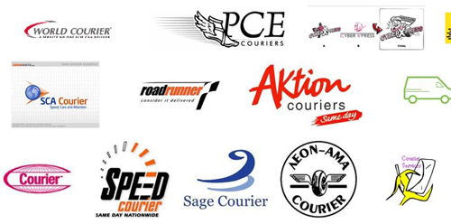
Another thing you need to think about is what kind of image that you want portraying your company. Do you want to go abstract or do you want to be more realistic? Professional or comic? All of these things can affect your design. Going back to the courier example, let’s look at a few logos that come up when one types “Courier Logo” into Google Images:

You have a wide range just from that one example! You have the very chiq professional all the way to a more comic style man running away with an envelope. All portray a completely different feel – and you have to make sure the one that you choose portrays not only your company and its culture, but also looks professional for the industry.
Do remember, going back to the quality from the previous point, if you do decide to go with a photograph ensure that you start with the highest quality, largest file you can! Keep this saved, backed up, etc, in a safe place because every time that you re-save an image you loose quality, so make sure you always have one copy that no-one’s touching that you can go back to if you need to.
There are so many more important things that you can talk about with logos just thinking about quality, but these are a few of the more important things to keep in mind. After thinking about writing this post we decided there really is so much to talk about regarding logos that we’re going to do two more posts on logos in the coming weeks, one focusing on how to use and not use text in a logo and the other about changing an existing logo. We look forward to sharing our thoughts on these important topics!
